Graphic Design Work
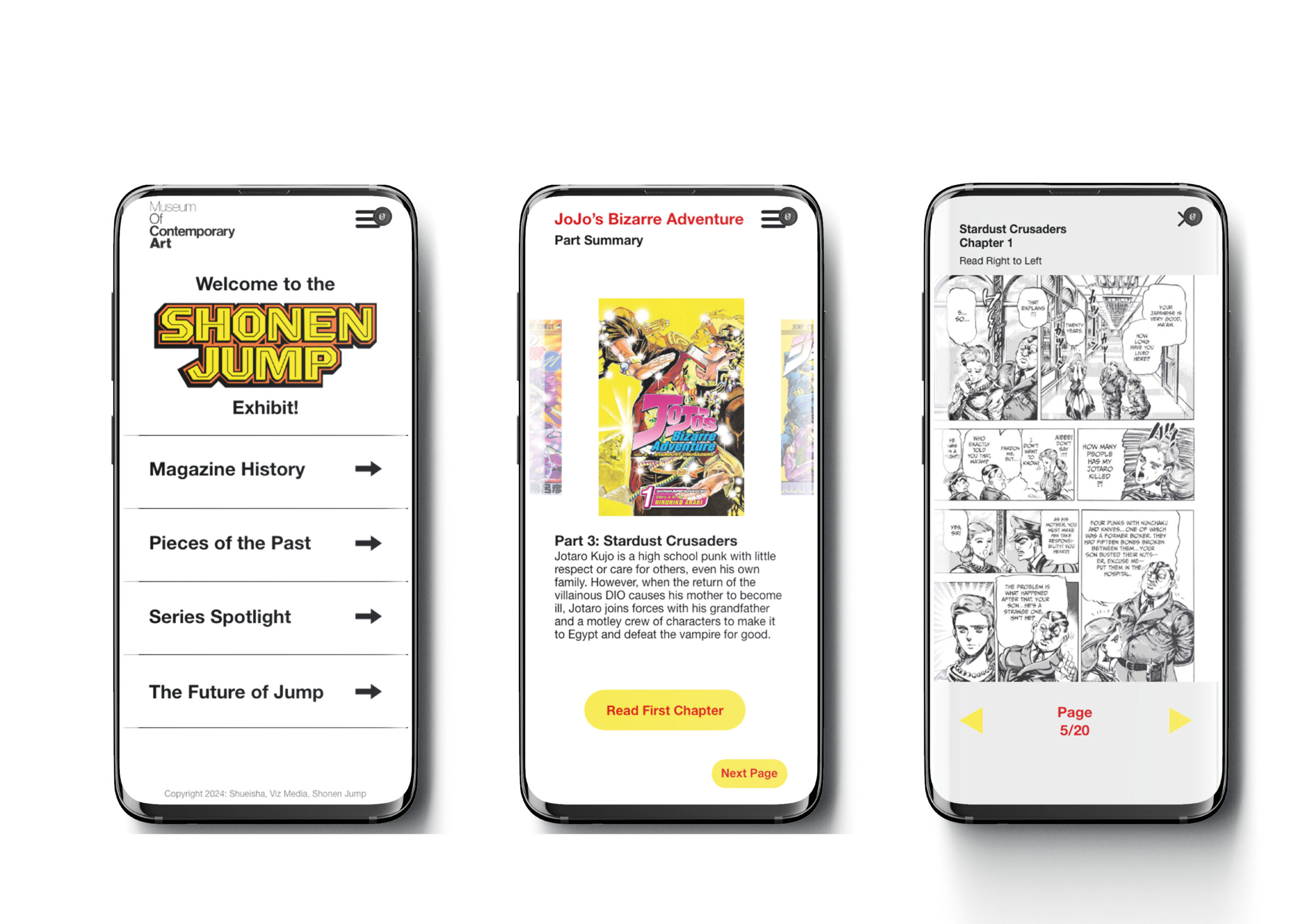
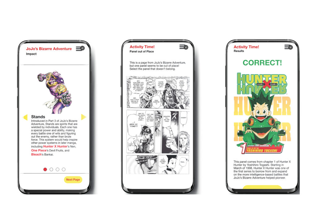
Shonen Jump Exhibit
This project was based around the creation of a phone app that would go alongside a fictional museum exhibit. We were given free reign to choose what museum and what topic this museum exhibit would be about, and had to create a series of screens to show how this app would be used and the interaction designs therein. I chose an exhibit on the Shonen Jump brand, something I am very passionate about and know a good deal about, as well as one that would translate well into digital. There were 8 screens made in total (though only 6 are shown here) which showcased how different sliders, buttons, scrolls, and menus would work and look when interacted with, alongside the brand identity of both the Museum of Contemporary Art and the brand identity of Shonen Jump.
The main purpose of the designed app screens is to teach the user about the manga JoJo’s Bizarre Adventure, show how a potential manga reading page might look, and then give them a small task to show they paid attention and learned something, before moving them on to the next part of the exhibit. The design was kept neutral and uncomplicated, as the function far outweighed the form, as an app someone would likely only use while at the museum. However, a consistent, simple design and colour scheme were maintained in order to make it look pleasing and as aforementioned adhere to the brand identity of both companies involved in this exhibit.
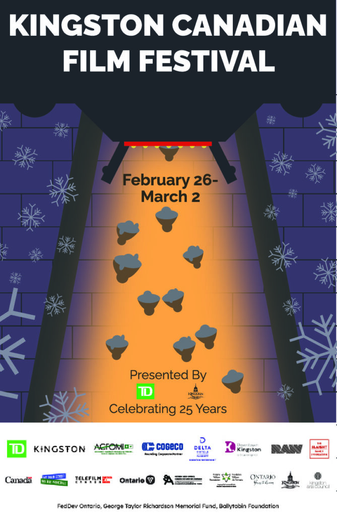
KCFF Poster
This was a proposed poster for the Kingston Canadian Film Festival. As one of the first projects with a real client, this project was a huge learning experience in terms of listening to what a client has to say, making the design documents and conducting research to understand their design wants and needs, and creating a design I thought was interesting and unique while also ensuring it met their design needs. Other than the copy on the poster we were given few creative limits and allowed to run wild, and this poster was a result of that.
During the first product pitch, the KCFF representative talked about how the festival took place at the end of winter, and how it was a last celebration during the cold winter months before March and spring came. Based on this comment, I designed the poster around the idea of those cold winter nights, dark and gloomy and atmospheric contrasted by the light of the movie theatre. This gave it a homely, warm vibe that felt inviting and friendly. The font was the KCFF brand font Raleway, and the logos were required additions by the organizers. It all came together to create a poster that I thought communicated the brand idea and message quite well, and demonstrated the ways I could use illustration and colour to create a design. While this poster didn’t get chosen for the festival, I am still proud of the experience and all that it has taught me.
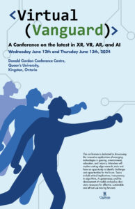
Virtual Vanguard Poster
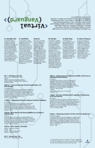
This project was a brand development task, with us creating a series of designs for a fictional conference. We were given a name and the copy necessary for a poster and brochure, and had to figure out how to lay everything in a satisfying manner that didn’t feel overwhelming or difficult to read. The first half of the project saw us create a poster and brochure, with conference speaker details, schedule, and additional information all necessary inclusions. This project was a great exercise in type management, brand identity, and finding ways to make design illustration for a text-heavy application without distracting from the important information and content. Finding ways to balance the heavy text without making it look overwhelming or overly complex was a serious challenge, especially because as a brochure there would be fold lines that text couldn’t go on top of. This meant that all content had to be broken up into eight distinct squares, somewhat limiting the design possibilities for type layouts. But out of these limitations came a design unlike anything I’d worked on before, and one that I think is special because of it.
Virtual Vanguard Website
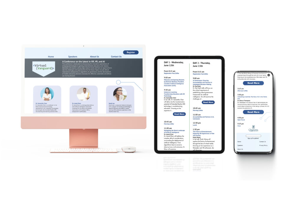
As a follow-up to the Virtual Vanguard poster and brochure, we had to continue the brand identity and information application onto a series of three website breakpoints. This project tested similar problem-solving skills as the poster, how to organize and distribute information while also creating brand personality, but this time through the lens of a digital interface (and how that changes depending on screen size) rather than a physical printed product. Due to things like the blue background from the poster not necessarily working for a website, or the illustrations of people using VR not being able to be included, there was a challenge finding ways to continue the brand identity. By using similar fonts, little illustrative elements from the poster, and a similar layout to the brochure, I was able to create a multi-breakpoint site that included all the inforamtion while still having personality and meshing well with the pre-existing brand identity.
Maxi Mex Logo
This logo was designed for a project about making a brand identity for a fictional restaurant. We specifically had to design the logo and menu for a business based solely off of its creative brief. Maxi Mex, the restaurant I got, was a friendly, extroverted little Mexican food place with large portions and family-friendly appeal. This project really tested me, and I had to go through a lot of iteration and sketching and idea generation, and I felt more lost with it than most projects I have received. However, I was able to stick with it and create a logo that I think works well for the kind of business and has plenty of personality and uses.
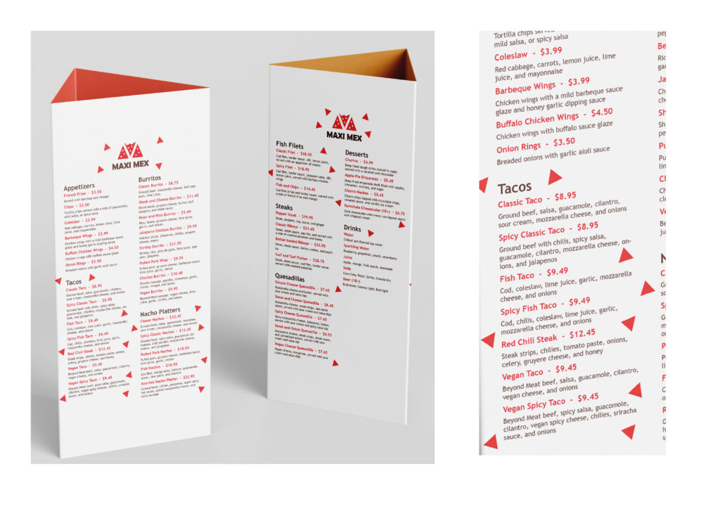
After designing the logo, I had to create a menu for the business, to show how the design identity could be carried over to other applications. Unlike the logo itself, the menu design was generally easier to design as I already had the colours and general brand idea figured out. Everything on the menu is my own copy, from the menu items to the ingredients to the prices of each product. This project also took a while, and was at times a difficult challenge in typographic layout, but that made it all the more satisfying to see it come together.